Digital Editing Basics for Sharing Your Prints
Simple techniques to enhance your photos before printing or sharing them with family and friends
Why Editing Matters for Your Photos
You've taken a beautiful photograph. The composition feels right, the light is perfect. But when you look at it on screen, something's not quite there yet. That's where editing comes in — not to change your vision, but to bring it to life exactly as you saw it.
Digital editing doesn't mean filters or fake effects. It's about making simple adjustments: brightening shadows, balancing colors, sharpening details. We're talking about the same techniques darkroom photographers used for decades, just done on a computer instead of in a chemical bath. The principles are identical.
Whether you're sharing prints with family, preparing photos for display, or just wanting your digital archive to look its best, these fundamental techniques will make a real difference. And you don't need expensive software — most of what we'll cover works perfectly well with free tools.
Start with Exposure and Contrast
The most important adjustment you'll make. Exposure controls overall brightness — if your photo came out too dark or too bright, this fixes it. Most editing software has a simple slider. Move it right to brighten, left to darken.
Contrast is the difference between lights and darks. A little boost makes photos feel punchier. Black and white prints especially benefit from increased contrast — it adds depth and drama. Try starting with +10 to +15% and see how it looks. You can always dial it back.
Quick Tips:
- Adjust exposure first, then contrast
- Watch the histogram — aim for a smooth curve, not clipped shadows
- Slightly increased contrast adds punch without looking artificial
- For family portraits, keep contrast moderate — avoid harsh shadows
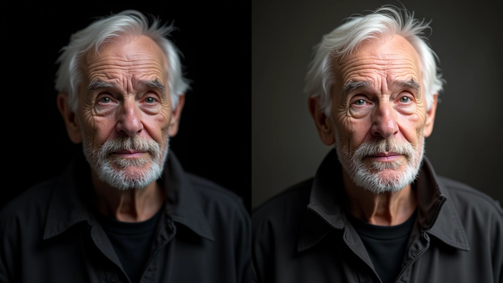
Recover Detail with Shadows and Highlights
Here's where editing gets powerful. Your photograph has detail in the shadows that you can't see yet — it's there, just hidden. The Shadows slider brings it out. Drag it up a bit and watch dark areas reveal their secrets. Same goes for Highlights — if your bright areas look blown out, you can often recover texture and tone.
These tools are especially useful for indoor portraits where half the face might be in shadow, or outdoor photos where the sky got washed out. Be careful not to overdo it though. A little shadow recovery looks natural. Too much looks processed and artificial.
Think of it this way: you're not creating new detail, you're revealing what the camera already captured. It's the digital equivalent of burning and dodging in the darkroom — just much more precise and forgiving.

Understanding Color Temperature and Saturation
Colors shift depending on lighting conditions. Indoor photos shot under regular bulbs look orange-yellow. Shaded outdoor photos look blue. This is called color temperature, and it's easy to fix. Most software has a Temperature slider — move it toward blue to cool things down, toward orange to warm them up.
Saturation controls how vivid colors are. For family photos, a tiny bump in saturation makes skin tones more appealing without looking fake. Maybe +5 to +10%. For landscape prints, you might want more — colors pop off the page. For black and white work, ignore saturation entirely. That's the whole point.
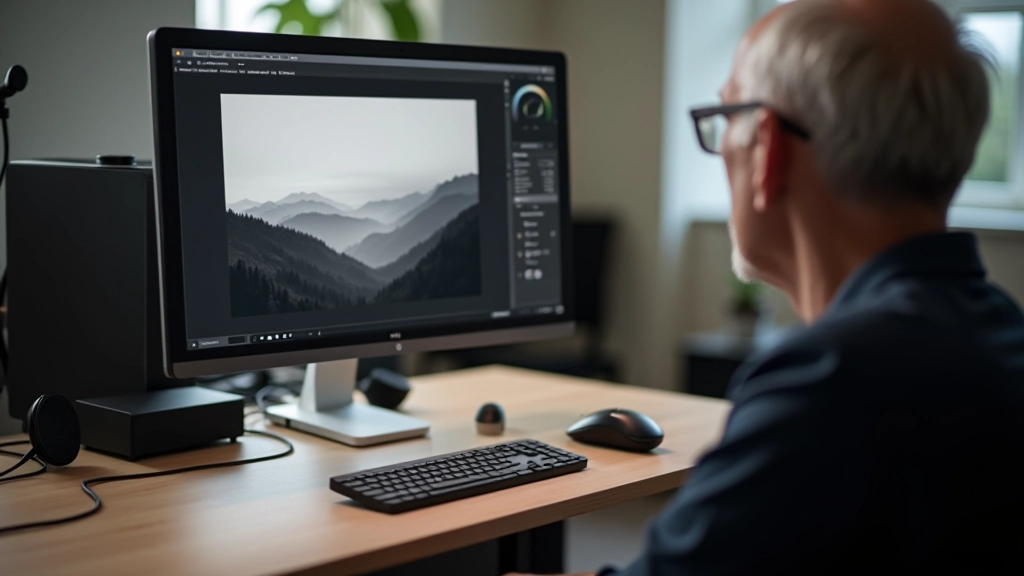
Your Simple Editing Workflow
Don't overthink this. Follow these steps in order, and you'll get consistent, natural-looking results every time.
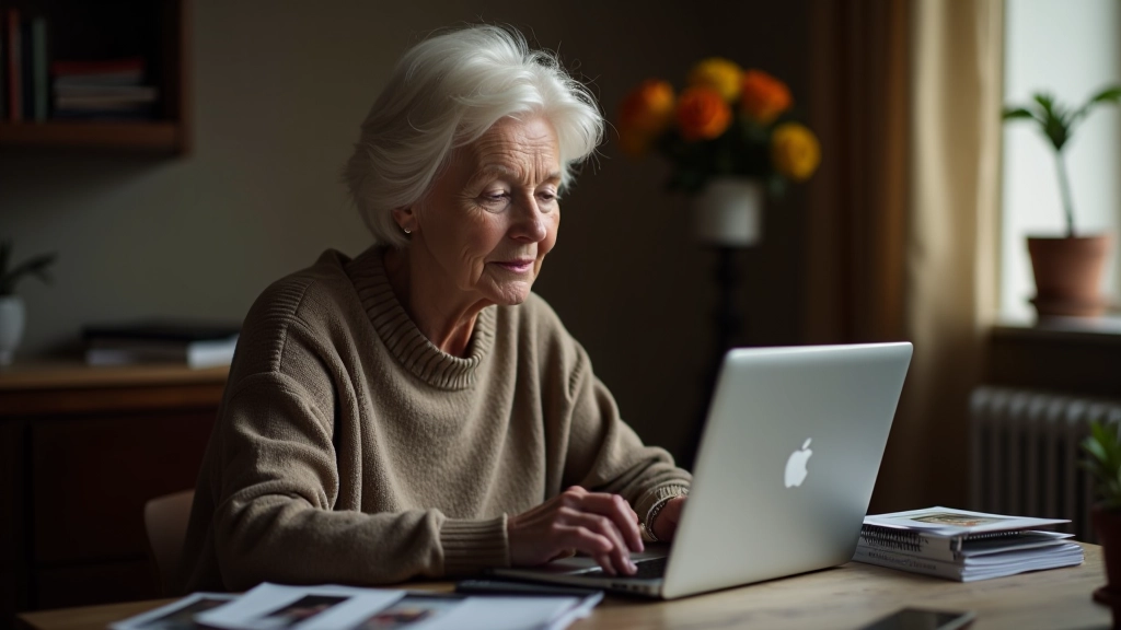
Import and Organize
Load your photos into editing software. Create a working copy — never edit the original. Most software handles this automatically.
Crop and Straighten
Fix the composition first. Straighten horizons, remove distracting edges. You're framing the photo exactly how you want it seen.
Adjust Exposure and Contrast
Brightness and contrast first. Get the tonal range right before anything else. This is your foundation.
Refine Shadows and Highlights
Bring back detail in dark areas. Control blown highlights. Be subtle — you're revealing, not creating.
Balance Colors
Fix temperature if needed. Adjust saturation slightly. Make skin tones look natural and warm.
Sharpen and Export
Apply sharpening last. Export for print or sharing. Save your edits as a recipe you can apply to similar photos.
Software Options for Every Budget
You don't need to spend money to edit photos well. Here's what's available at different price points:
Free Options
GIMP, Darktable, and Photopea have everything we've covered. They're genuinely powerful. The learning curve is steeper, but you'll have full control over every adjustment.
Mid-Range
Lightroom ($9.99/month) is brilliant for photographers. Intuitive sliders, non-destructive editing, and it handles entire photo libraries. Capture One is similar but more powerful for advanced work.
Professional
Photoshop offers everything but overkill for basic editing. Affinity Photo is a one-time purchase with professional features. Most photographers never need this level.
You've Got This
Editing doesn't have to be complicated. You're not learning Photoshop tricks or mastering advanced techniques. You're learning the fundamentals — the same principles that darkroom photographers used for 80 years. The medium changed, but the ideas stayed the same.
Start simple. Open a photo. Adjust exposure. Boost contrast. See what happens. Undo if you don't like it. That's the beauty of digital — there's no chemical bath, no wasted paper, no consequences to experimenting. Play around. Your instincts are better than you think.
The best edit is the one you barely notice. When someone looks at your photo and thinks "that's beautiful" instead of "that's heavily edited," you've done it right. And once you've mastered these basics, you'll have the foundation for anything more advanced you want to explore.
About This Guide
This article provides educational information about basic photo editing techniques. Results depend on your camera, software, and personal preferences. We recommend experimenting with your own photos to see what works for your style. Different situations call for different approaches — these are guidelines, not rules. Always save backups of original files before editing.